


Nourishh
Brand Design
Nourishh is a restaurant and café designed to be accessible to those who experience overstimulation and sensory overload.
Read the full case study on Medium
Brand Design
Nourishh is a restaurant and café designed to be accessible to those who experience overstimulation and sensory overload.
Read the full case study on Medium
Project Coordinator
Jenny Kowalski
Jenny Kowalski
The challenge
The project was completed during the height of the pandemic, when global suspicion for crowds and public spaces brought forth new awareness to a long-standing issue in accessibility: sensory-friendly design.
Of course, the issue isn’t new; a wide variety of people experience sensory overload, from those with autism and ADHD to PTSD and anxiety. Solutions for sensory overload are few and far between within the restaurant design space.
The greatest challenge in designing for sensory accessibility is known as “conflicting access needs”: design solutions that work well for one user might be harmful for another. Design solutions in this area must be able to adapt to a customer base whose needs are highly personalized.

The process
Since the restaurant caters to a large demographic of people, it was essential to get input on the brand from as many voices as possible. The goal was to get the most cohesive possible picture of what the ideal sensory-friendly restaurant should be, and what features would make it most accessible to a clientele with a range of personalized needs.
Research for Nourishh included journal research, interviews with disability authorities, and social media surveys targeted towards college-age adults with sensory processing conditions.
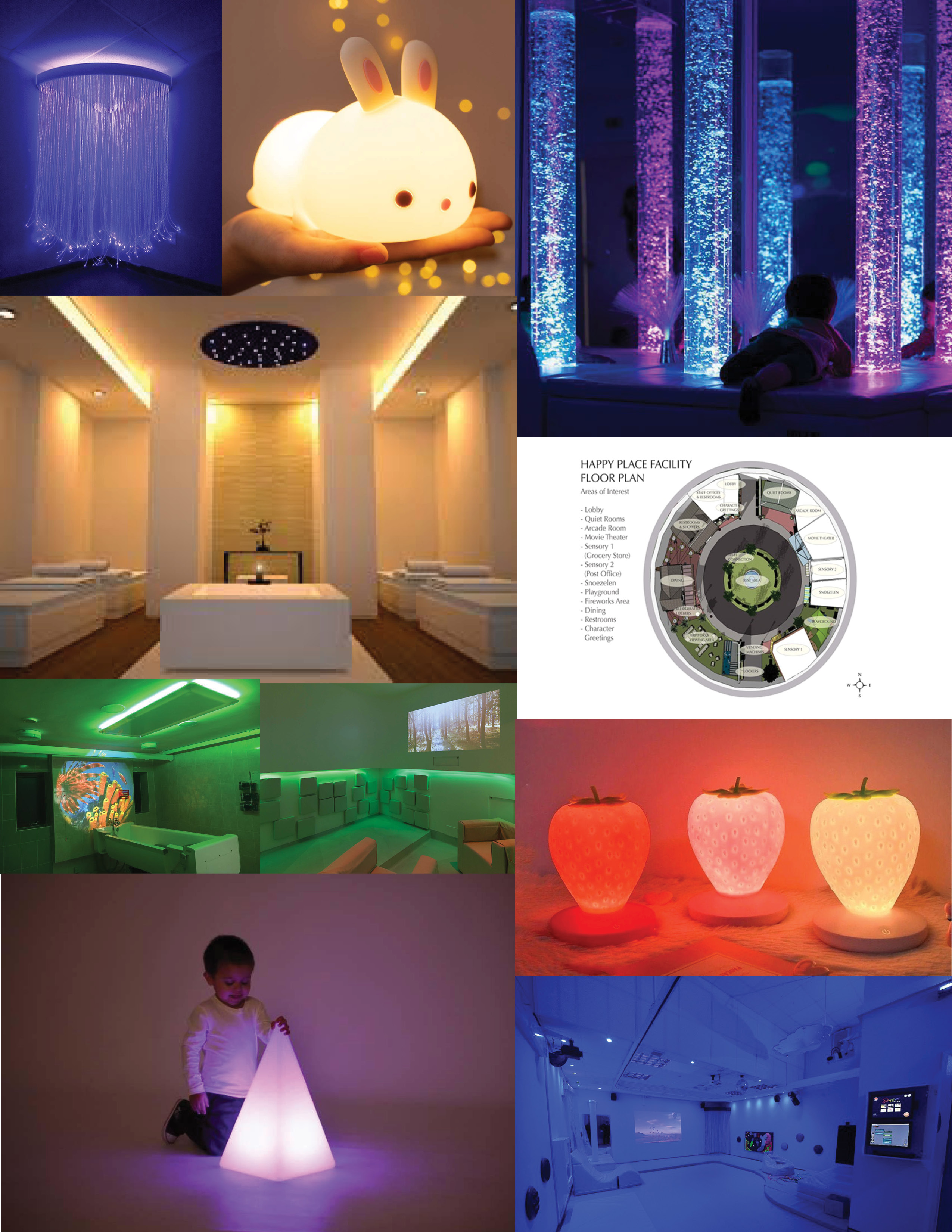
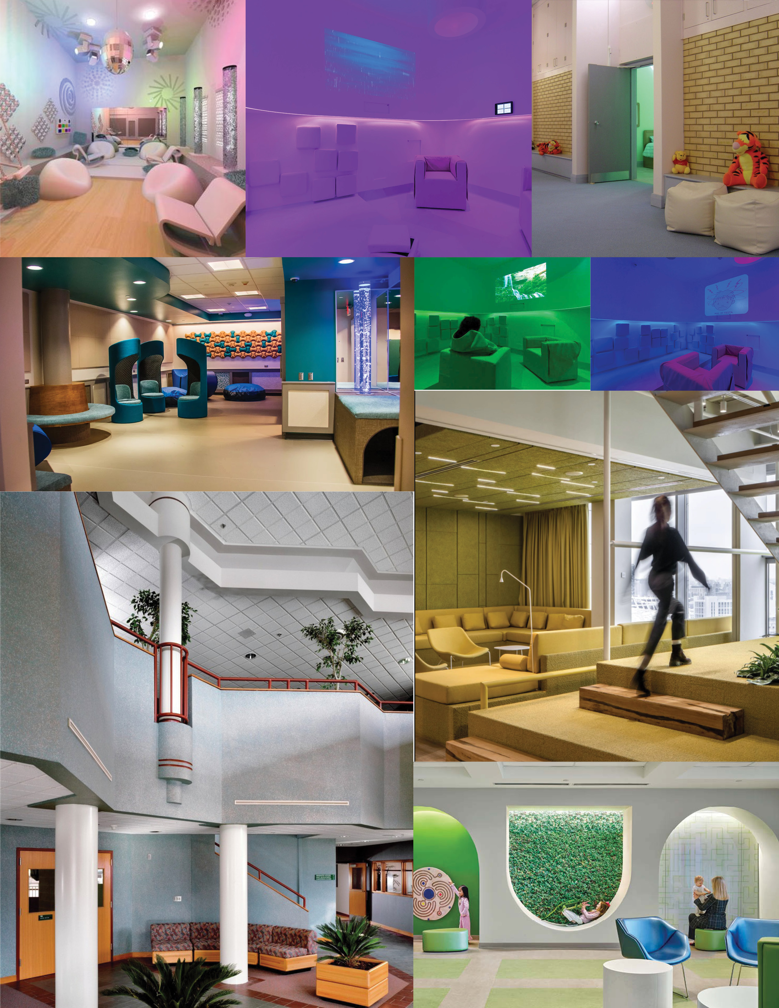
Survey respondents wanted soft colors and textures, low ceilings, muted sound, and isolated/semi-isolated spaces These findings echoed design standards on the subject, which also called for natural lighting and sound, wheelchair-accessible navigation, and open space.
In interviews, Temple’s Disability Resource Center recommended that the space include indoor maps, intuitive wayfinding, a customizable environment, and optional human contact.
Since the restaurant caters to a large demographic of people, it was essential to get input on the brand from as many voices as possible. The goal was to get the most cohesive possible picture of what the ideal sensory-friendly restaurant should be, and what features would make it most accessible to a clientele with a range of personalized needs.
Research for Nourishh included journal research, interviews with disability authorities, and social media surveys targeted towards college-age adults with sensory processing conditions.
Survey respondents wanted soft colors and textures, low ceilings, muted sound, and isolated/semi-isolated spaces These findings echoed design standards on the subject, which also called for natural lighting and sound, wheelchair-accessible navigation, and open space.
In interviews, Temple’s Disability Resource Center recommended that the space include indoor maps, intuitive wayfinding, a customizable environment, and optional human contact.
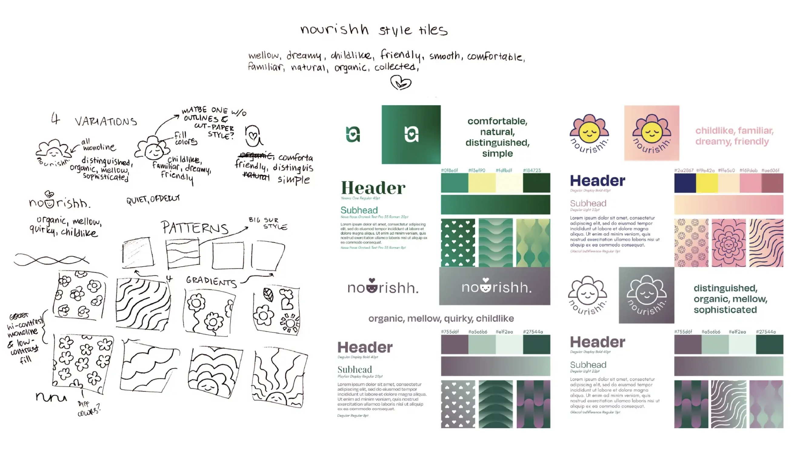
After reviewing the research, it was clear that the Nourishh brand needed to focus on environment and user experience. From here came the brand’s mission statement, customer empathy map, and core deliverables. Each is designed to offer the customer as much customizability and ease of experience as possible.
The final product
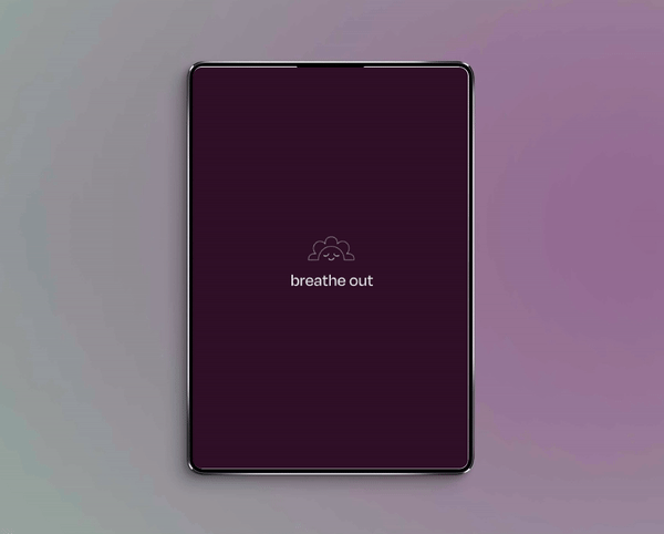
The Nourishh brand is designed to foster a sensory-friendly environment that minimizes human contact. Muted, natural colors and gradients reference the restaurant’s soft environmental lighting while creating opportunities for high-contrast type.
The Nourishh brand is designed to foster a sensory-friendly environment that minimizes human contact. Muted, natural colors and gradients reference the restaurant’s soft environmental lighting while creating opportunities for high-contrast type.


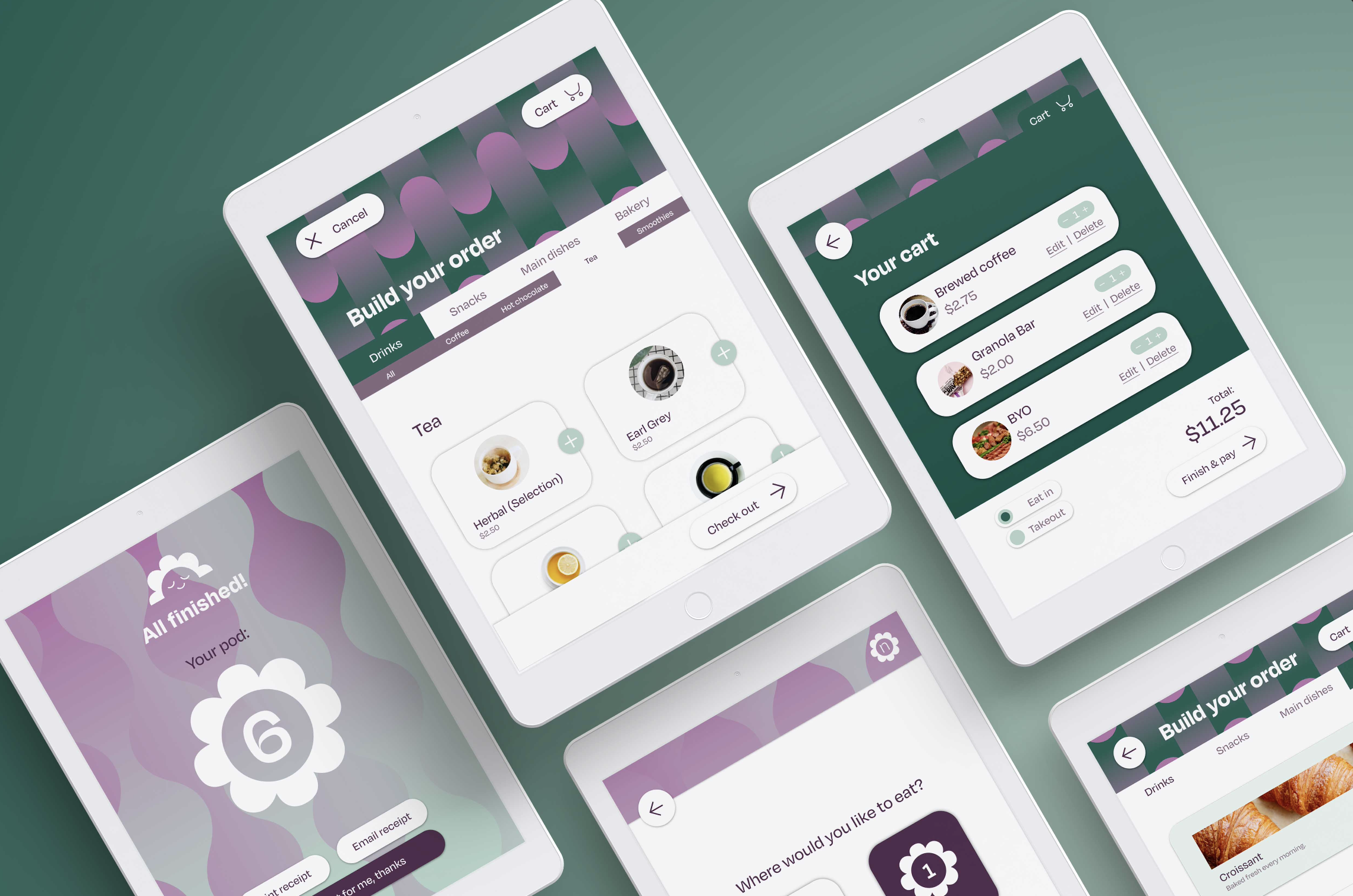
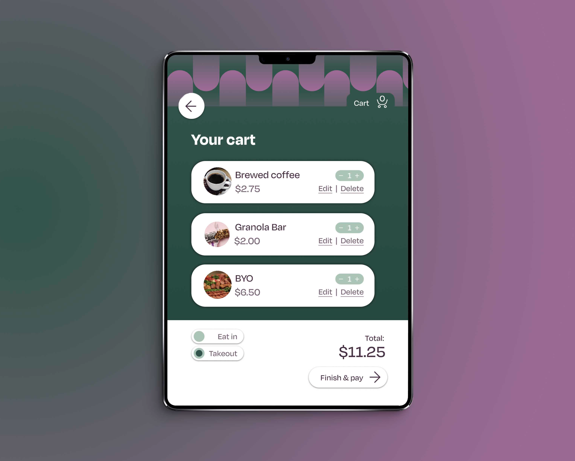
Environmental design is central to the user’s experience. The floor plan is designed to minimize sharp corners and open spaces, as well as including enclosed “pods” that allow visitors to order food without human contact. Wayfinding is designed to fit both the environment and the user base (for example, floor signage for customers who may be looking down or avoiding eye contact).
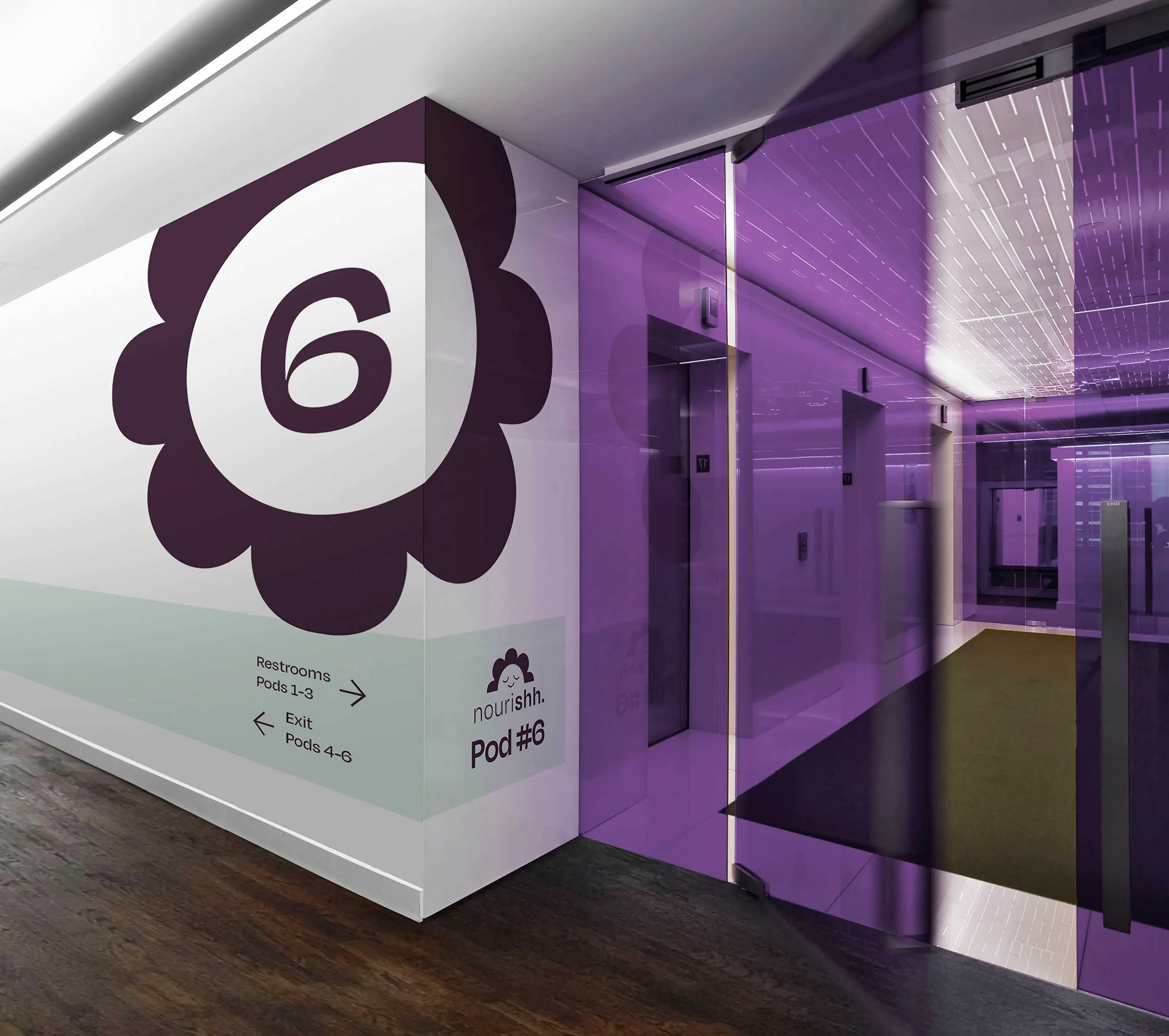

A digital menu serves as a contactless option for visitors to order food, as well as a hub for customizing environmental lighting and sound.


What I learned
- Human-centered design: creating a product based on feedback from the target audience.
- Problem-solving: learning to design for conflicting access needs.
- Accessibility: designing with accessibility as the main focus, not an afterthought.
- Hybrid design: Creating UX and brand designs that inform each other to create a cohesive final product.
Nourishh is a study in sensory-friendly restaurant design, an underexplored sector in accessible design and architecture. Future projects could be an opportunity to innovate how we design sensory-friendly public spaces.
Read the full case study on Medium
Read the full case study on Medium